GovOS Design System
In 2021, I joined GovOS as the company's first in-house designer. For years they'd pieced design together through contractors and had no visual design ethos or design system. I was tasked to build a complete design system from scratch. I created foundations like the color scale and type scale, made 30+ components, and managed building the system in React.
I chose to work in govtech because I believe governments should provide excellent services to its citizens. Building this system was an opportunity to improve how millions of people interact with essential public services.
Storybook Documentation ↗Design Tokens @ NPM ↗
Problem & Needs
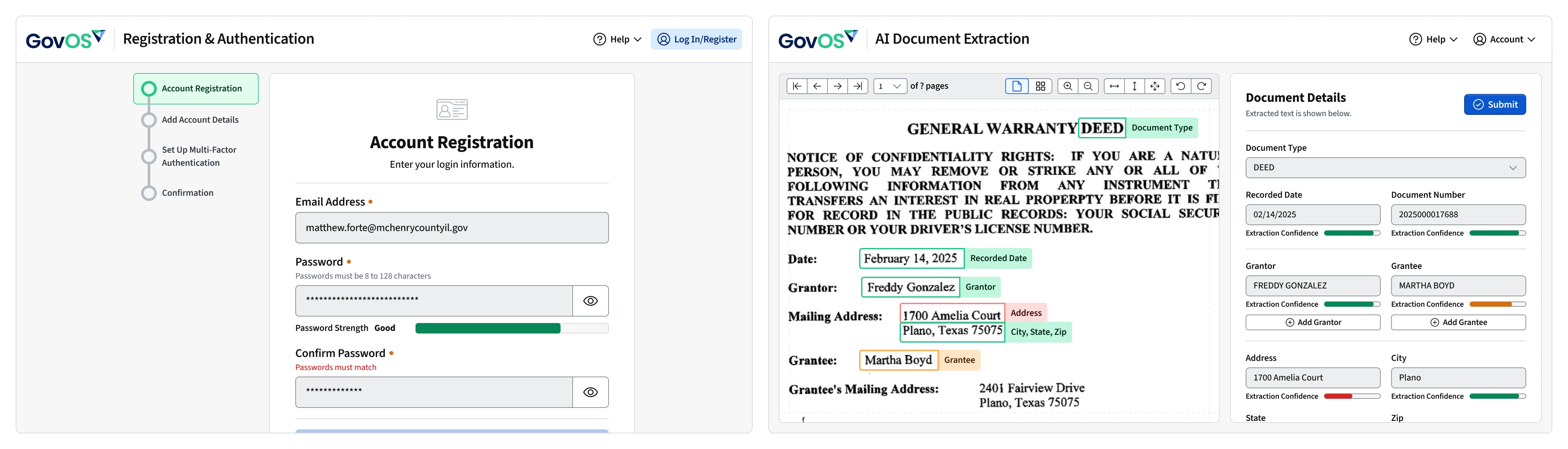
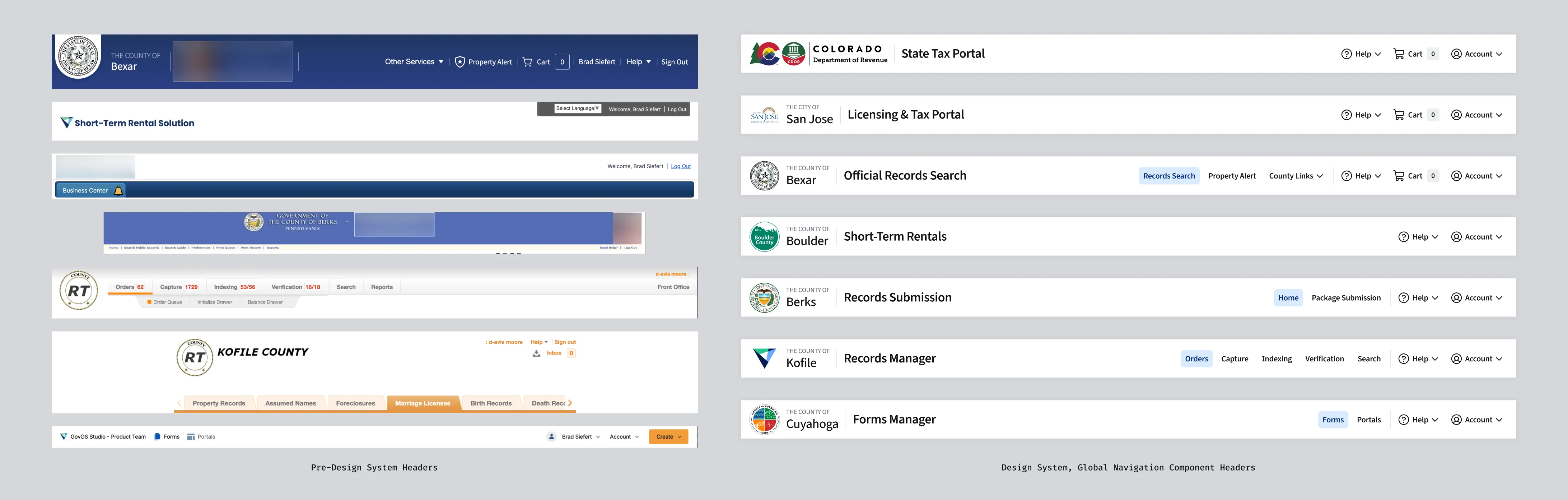
GovOS delivers critical government services like tax payments, business licensing, records management, public records search, short-term rental payments, and more to hundreds of jurisdictions. Before I joined, it's products lacked any visual consistency, shared zero components or code, and federal/state web accessibility requirements had been ignored for years. In my time at GovOS, I changed all of these things. During my tenure, I created a scalable design system that became the foundation for GovOS products and beyond.
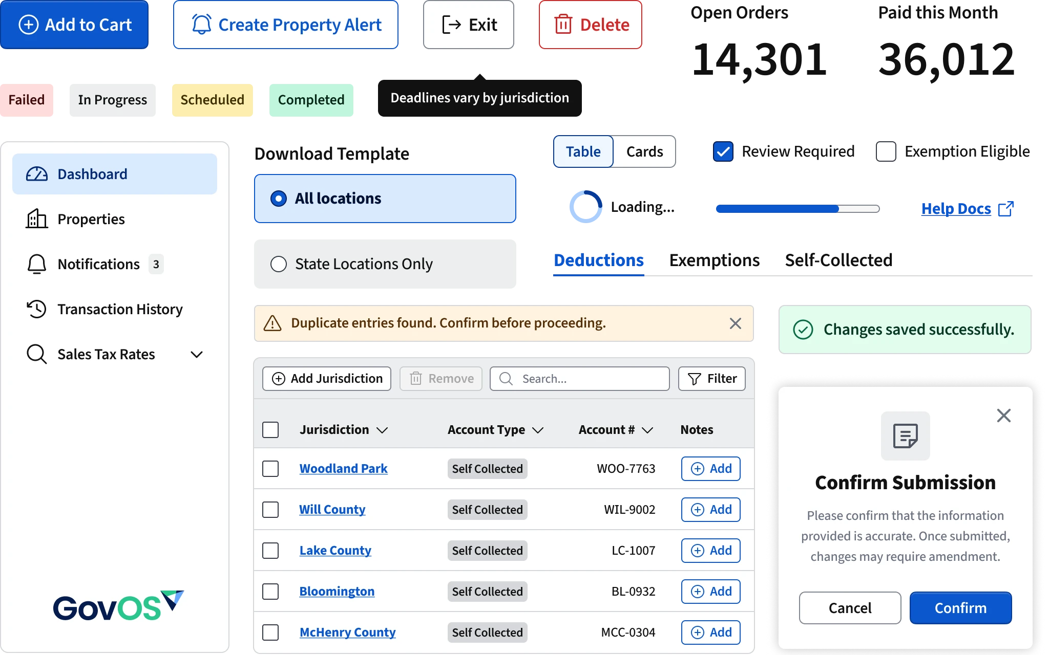
The lack of a cohesive visual design and a design system created significant inefficiencies for both designers and engineers. There weren't any shared UI components or platform level code. Every new product or feature was effectively starting from scratch, which led to duplicated effort and inconsistent patterns. Designers had no shared library to work from, so visual styles varied widely between applications.
Because front-ends were so brittle, developers rarely made updates. They didn't have design assets to go off so when they made changes they hard-coded colors, spacing, and typography and never addressed the design debt, resulting in fragmented user interfaces.
The absence of a design system limited the ability to expand products with new features, slowing down development, and creating more and more technical debt. It even effected our sales team because our products were so disconnected from each other it was difficult to say our applications were a real suite of products.
Visual Design Principles
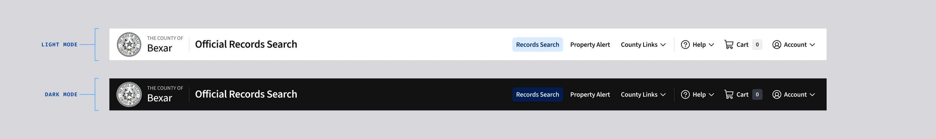
Whenever I start a design, I am always on the lookout for how the visual design rules dictate to look and feel. Choosing a bold color palette or an extremely minimalist aesthetic looks great in Figma, but our users needed something more dependable and straightforward in the real world. When I began building the GovOS design system, I wanted the visual language to reflect clarity, trust, and accessibility. The audience for these products isn't creative professionals used to subtle visual nuance. It's users are citizens paying taxes, requesting records, and managing essential services. Every element needs to be obvious, direct, and legible.
These choices became guiding lights for the system:
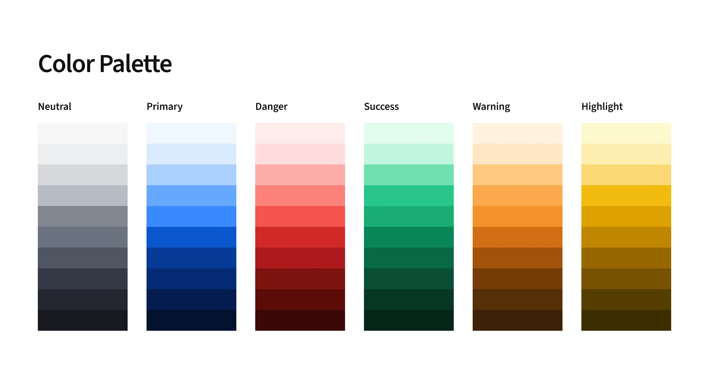
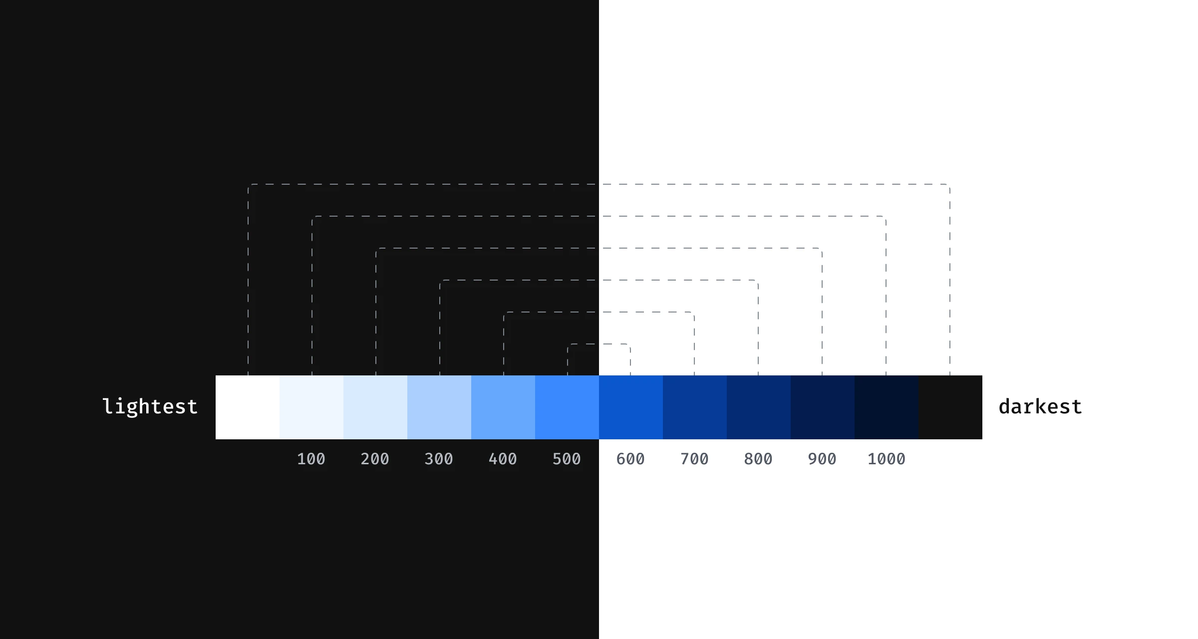
- A basic and bright palette. My color palette isn't flashy, but it's reliable and predictable. I anchored it around my
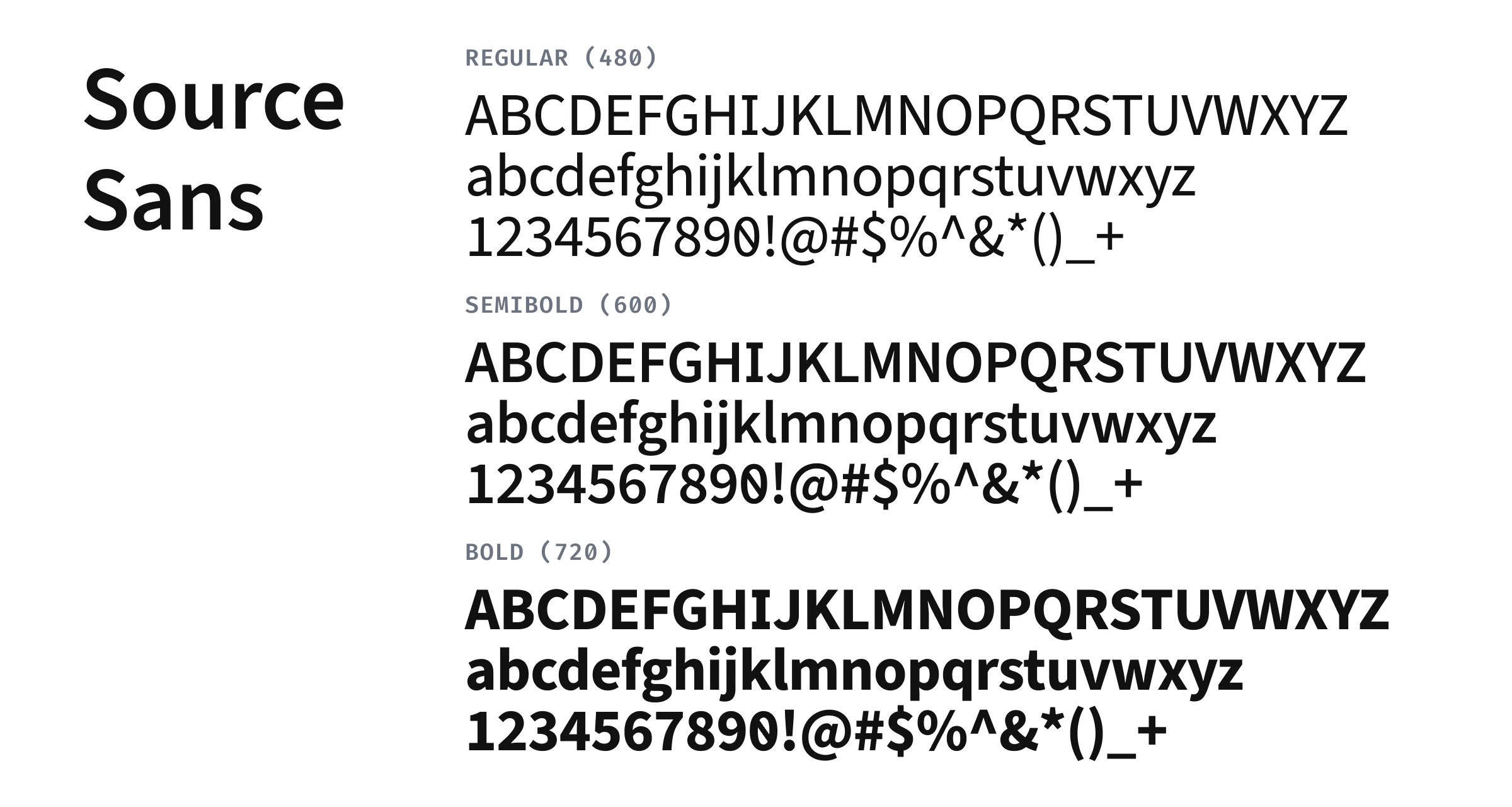
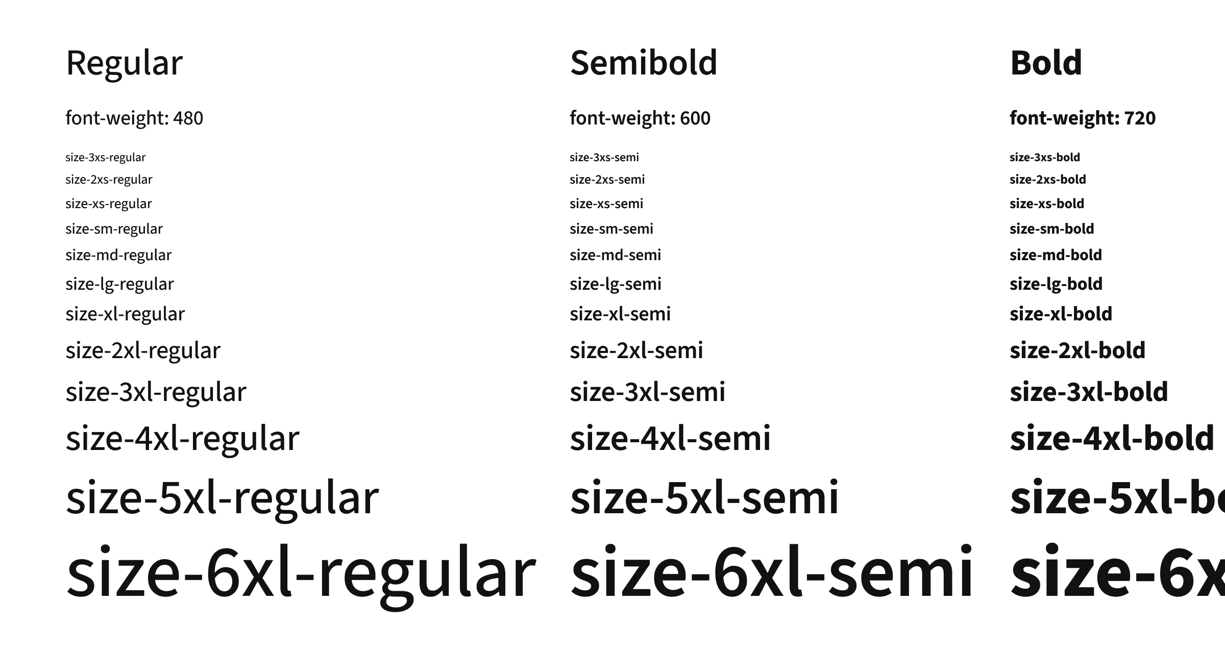
color-blue-600color for primary actions and chose neutrals that pair perfectly. The goal was to feel solid and professional and honestly at times, middle of the road. I never wanted it to feel overly branded or distracting. I often preached to hat our colors must follow the color roles(primary, danger, warning, success, & highlight)we setup to ensure consistency. - A single typeface and a large type scale. I feel strongly that all typography should be tied to a type scale via design tokens. This ensures consistent line heights, letter spacing, and makes visual rhythm easier to achieve. The list of great UI typefaces is not very long and for this system I chose Source Sans 3 because it's previous use in federal web applications, clean aesthetic, and variable font weight to allow me to create a nice contrast between the three font weights.
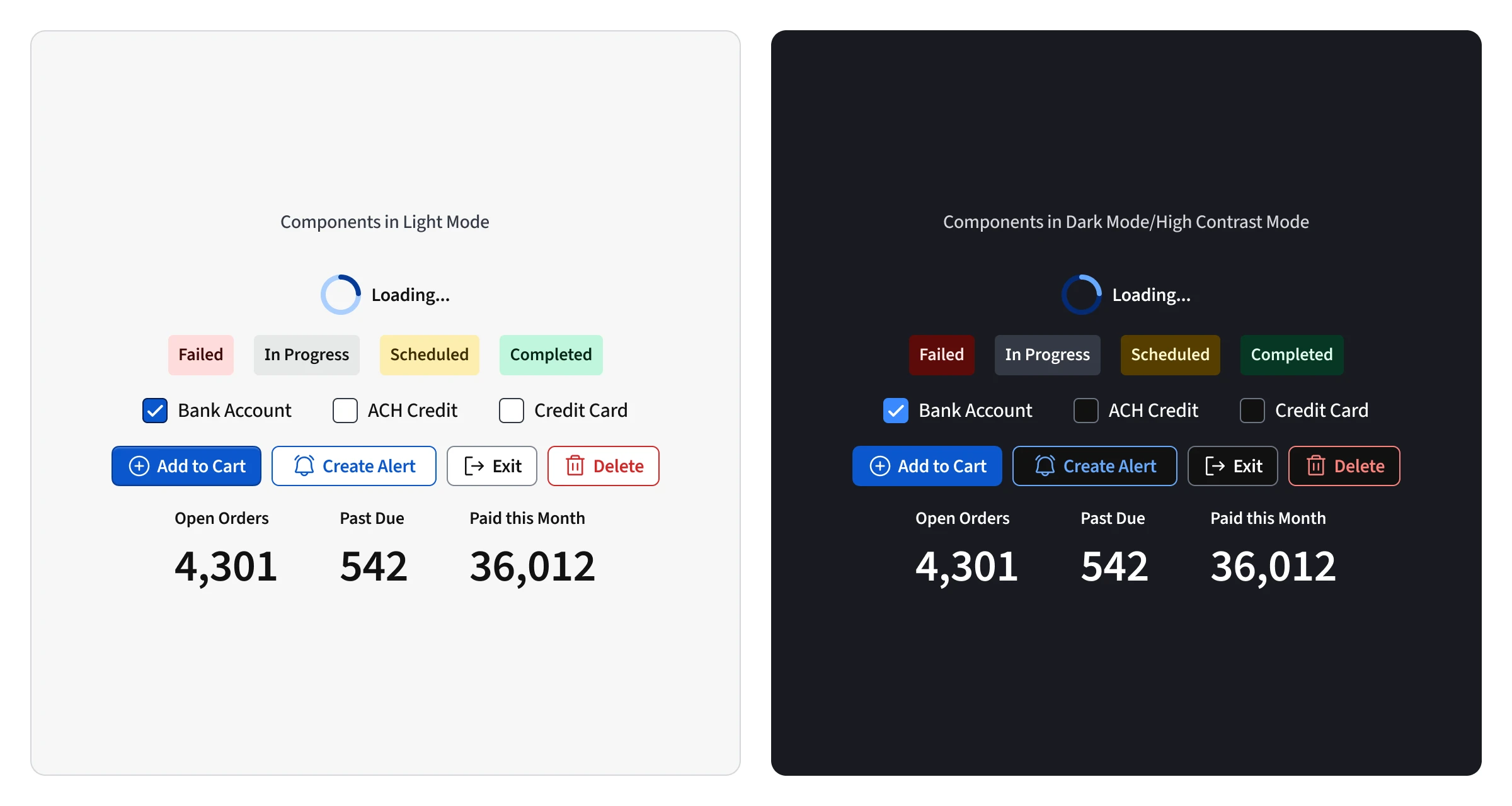
- Clean borders and almost no shadows. Instead of trendy shadows or heavy visual depth, I leaned into a very flat aesthetic. Cards and surfaces are defined with a light border (
color-neutral-300in light mode) and were always set oncolor-neutral-100to have a subtle but clear contrast from the background. I wanted our UI to feel like a sheet of paper on a desk. This created a clean separation without any visual noise. - High contrast and accessibile. GovOS's previous used overly subtle color opacities for their color palette. At times, they were almost indistinguishable from each other causing usability and accessibility issues. Accessibility had not been taken seriously in the past, but for me, it was non-negotiable. Rather than barely meeting minimum contrast requirements for text, I setup the system to well exceed them. Subtle text styles, tints, or shades were avoided. Our users needed clear differences in states, hierarchy, and affordances, so everything was designed for maximum clarity.
Platform 🤝 Product
Building a great design system has to include decisions that shape and serve products. It can't just be a toolkit of UI elements. Every component and pattern I create is meant to serve and align products and the business as a whole. The system is built to serve design, engineering, and product.
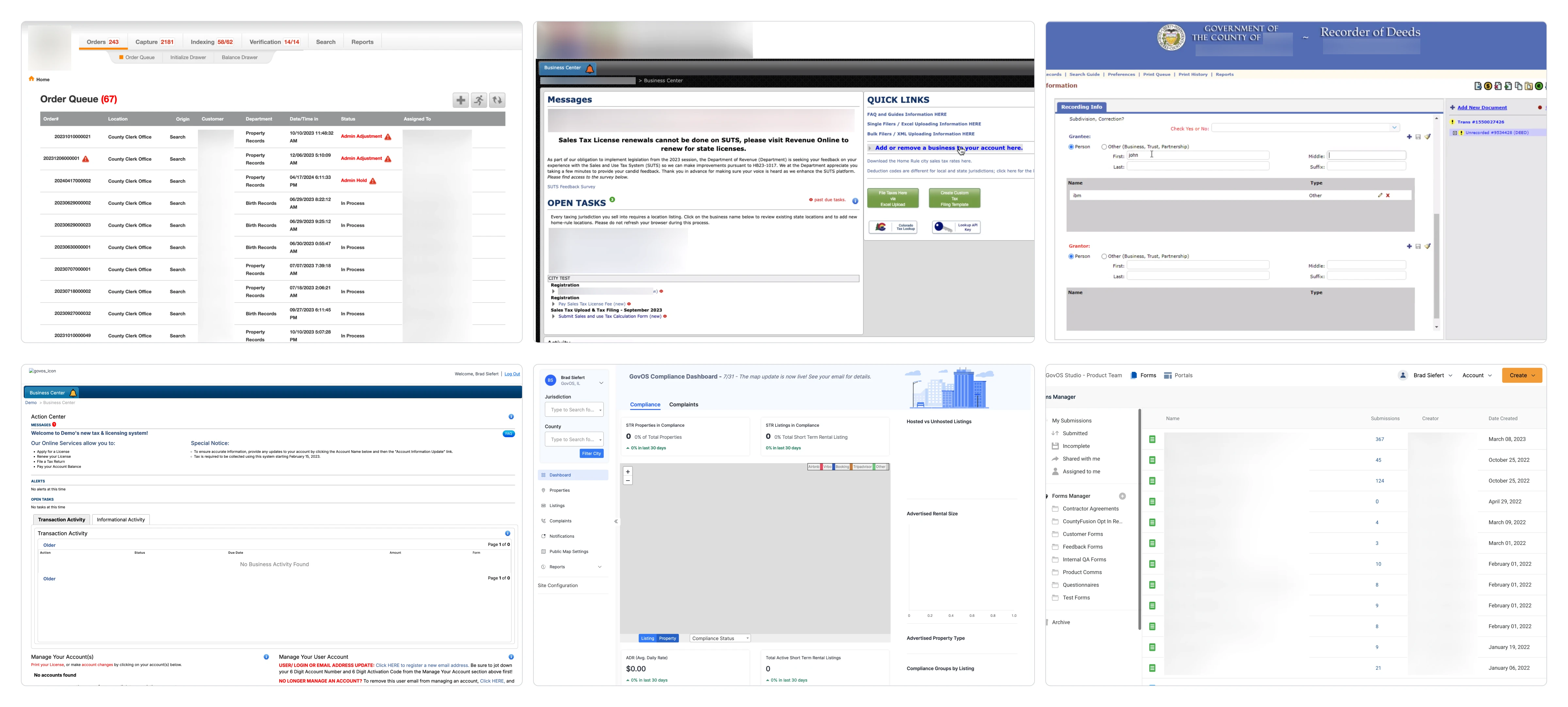
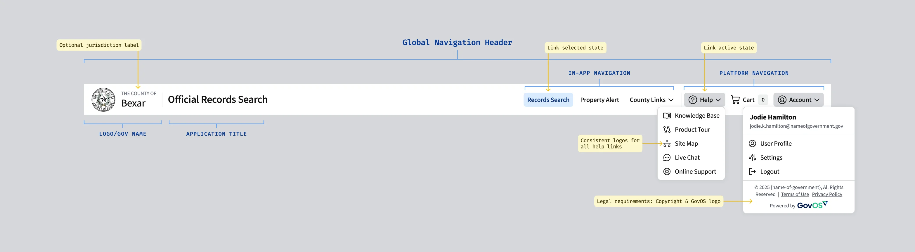
Product alignment is extremely hard to accomplish. It requires auditing, alignment, vision, and buy-in. It's rare that product folks have the time to do this kind of work. They are often required to take a very myopic view that only includes their product. I think design systems are powerful tools for aligning platform-level patterns and my favorite example from my time at GovOS is global navigation.
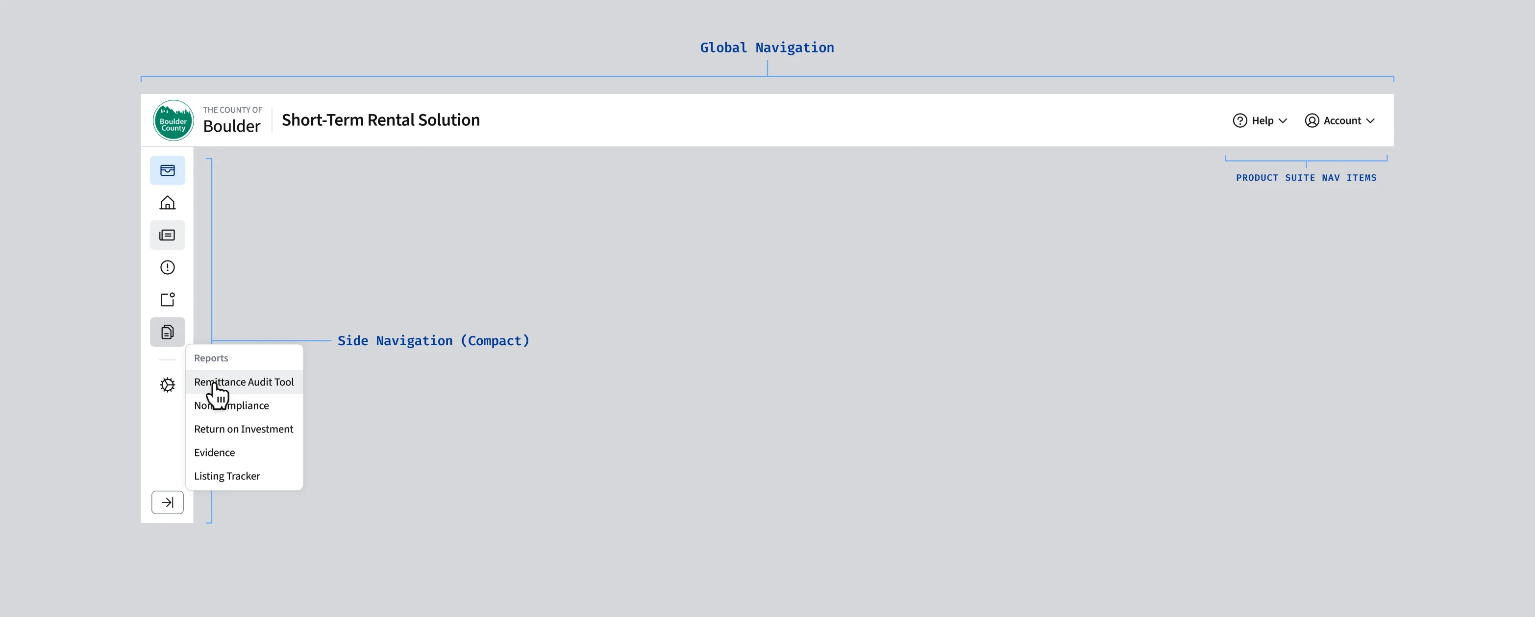
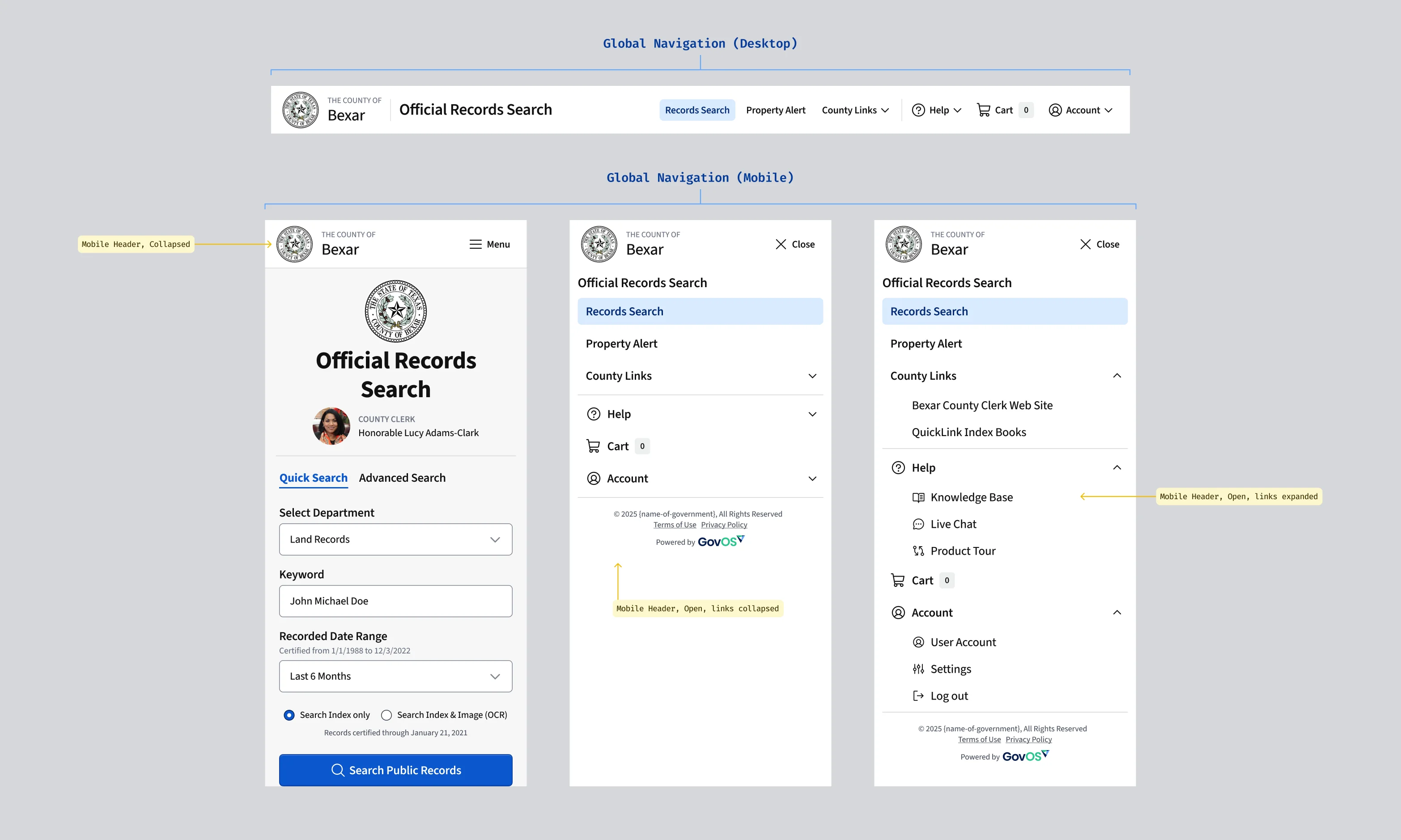
Documentation for All
Documentation is the differentiator between a system that is used and a system that is ignored. I spend a huge amount of time writing and creating design documentation for the system. Above all, I want the system to be easy to use and understand for both designers and developers. Writing plain written and clear documentation and creating assets to explain the documentation, makes that a reality.
Content writing seems like such a straightforward task, but anyone who has tried it will tell you it's incredibly difficult. It requires a deep understanding of design principles and engineering best practices and the ability to write in a way that is both precise and concise. I never considered a component or pattern done until the design and development documentation was written. Without great docs, there's no chance it'll be used right.
In Practice
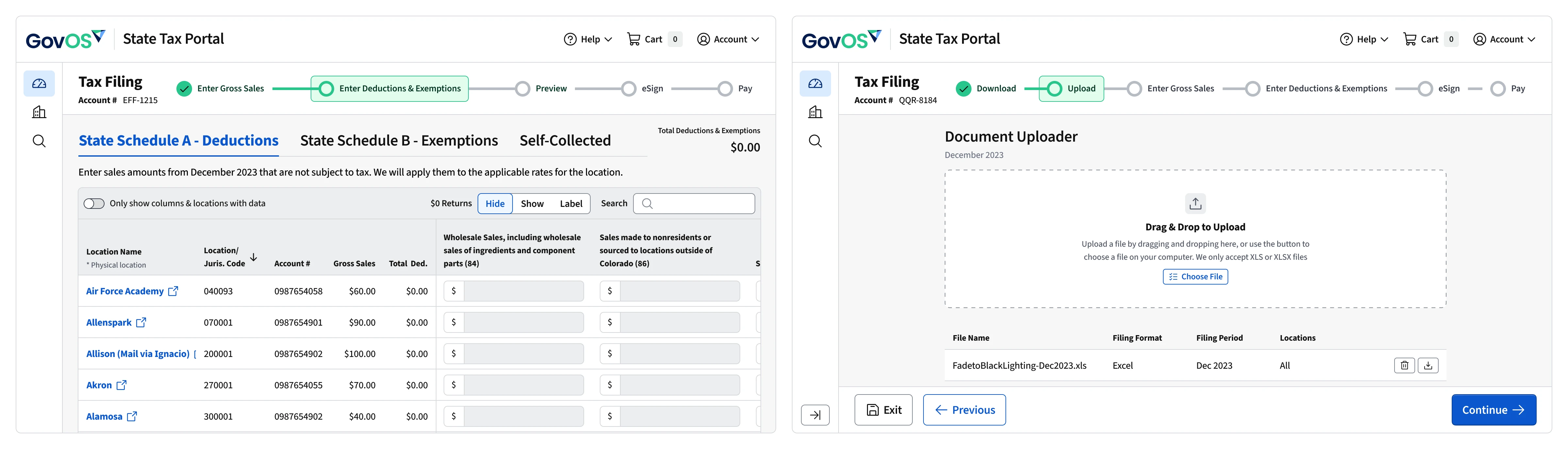
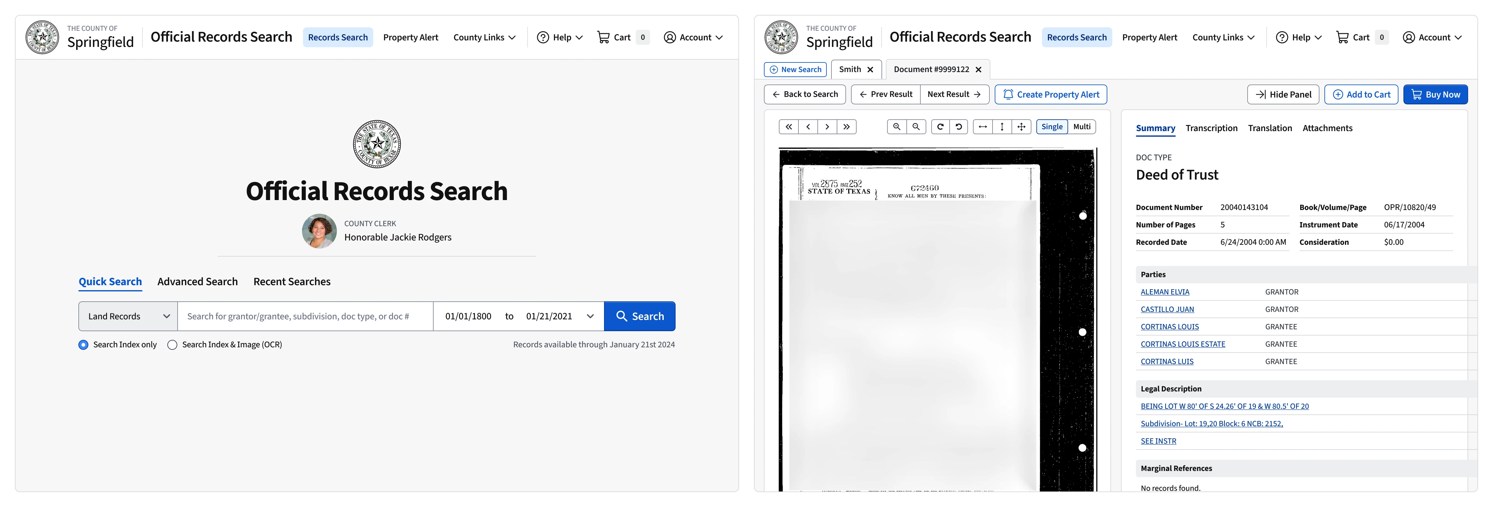
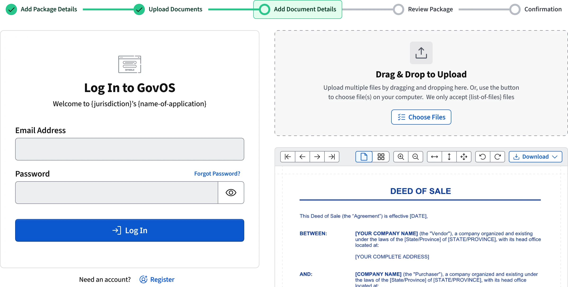
Once the system foundations were solid and core components were created, the next step was collaborating with other UX designers to create mockups and user flows. Designers used the system to create a redesigned tax portal for State of Colorado and Alaska, updated our public search portal, and created platform components to be shared across all applications.
Collaborating with other designers is important to me and comes naturally for me. Especially during the design process for the tax portal redesigns, I collaborated closely with designers to adapt components to their needs and participated in design critiques and reviews to make sure they knew my intentions when designing the components and patterns. It was the first stress test for using the system in such a large scale and on such a short timeline. It performed extremely well and allowed me to focus on the larger goals of maturing the system while still maintaining consistency across the product suite.