Nielsen Global Design System
In mid 2021 I began designing a new, from scratch, design system for Nielsen. It was exciting because the challenge and the opportunity were both clear from the start. Nielsen has over 40 web applications on at least 5 different development platforms. This complexity hurt product quality and hampered designer's ability to create. There was a mandate from UX and Product to consolidate the UI components and patterns into a single design system. This new system would fuel a new application suite, Nielsen One, and eventually the whole organization. That is how Nielsen's Global Design System (GDS) came to be.
In addition, Nielsen's marketing team was in the middle of a secret brand overhaul. I joined those branding conversations to help make a few key decisions. I convinced the team to choose Inter as Nielsen's core typeface for marketing and interfaces. Inter provided sharp clarity, flexible styling, and a wide language support that we required. I also helped educate the team about potential accessibility issues with the vibrancy of their new colors. We made the necessary tweaks and created color palettes that would serve both the marketing team and UX team.
Building the Foundation
I've found that the more care you put towards building the smallest core pieces of a design system, the better results when scaling the system. The choices for token naming, color scale, line heights, spacing, and even writing standards are all incredibly important. These tiny choices cascade and reverberate throughout the system as it grows. If done well, they become a firm foundation for the system to grow upon. If done poorly, apps are more likely to devolve into standard-less one offs with abandoned components.
Design Principles
Nielsen's core values are inclusion, courage, and growth. Those values drive the company, but I wanted to craft values that were specific to the design system. From our company values and interviewing our designers and customers, I created these core design principles for GDS:
- Built For Our Users
- Always Accessible
- Consistency not Uniformity
- Inspire Trust & Confidence
- Strive for Elegance
- Efficient for Designers & Developers
These values are important to me because they reflect who I am and the systems I strive to create.
For more information, visit the Design Principles on GDS.
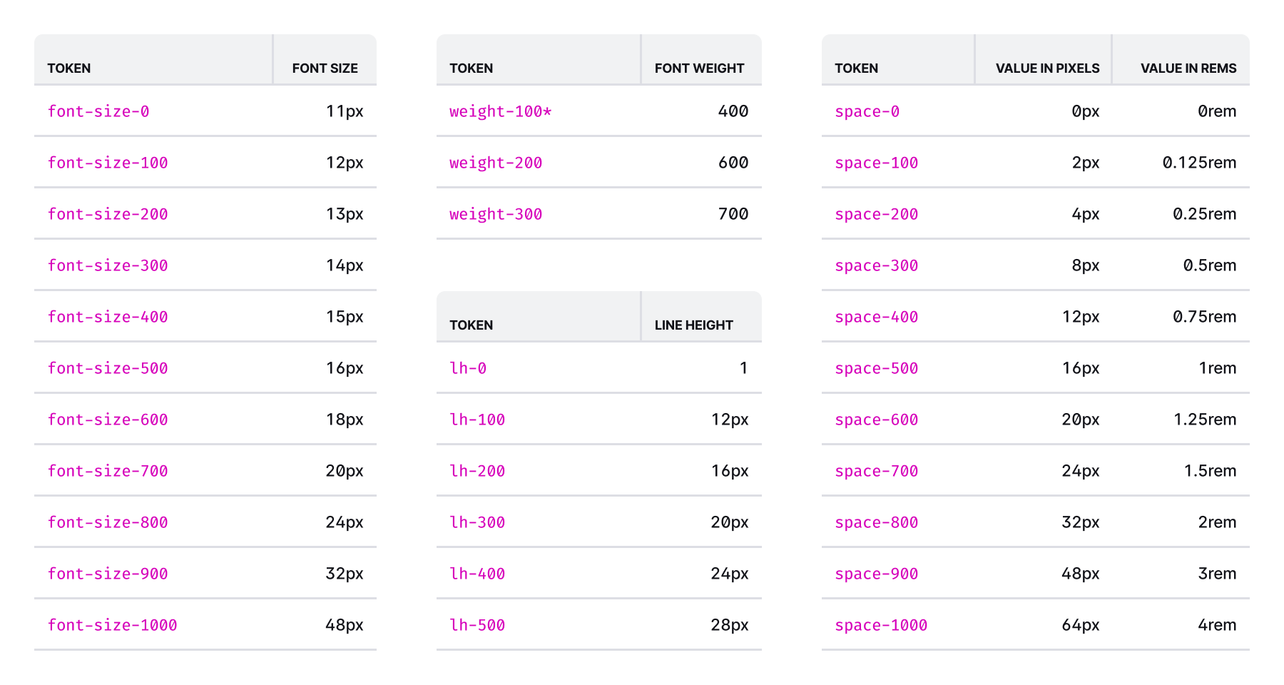
Design Tokens
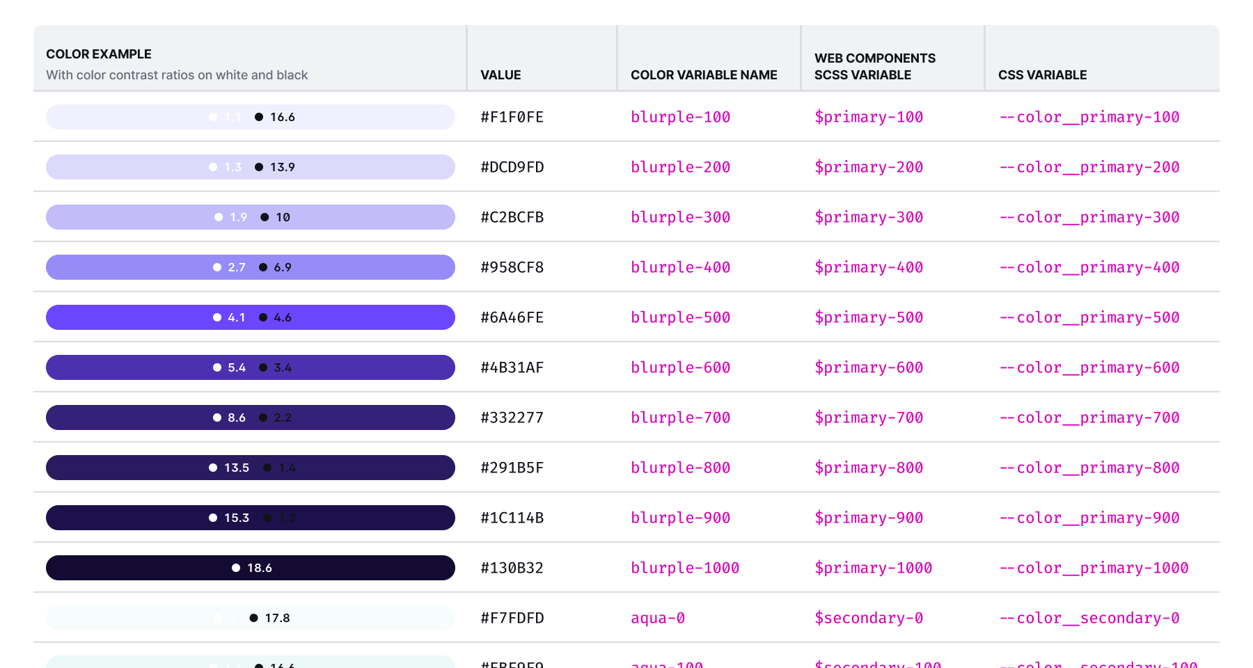
Design tokens are an abstract, human-centered way to store variables. Tokens are useful because they provide consistency and are easier for humans to reference than hard-coded values. I've found that tokens become a shorthand for talking about the design system. They make it easier to speak about design decisions. For example, saying "Do you think that blurple-300 or blurple-400 looks better?" is much easier to understand than "Do you think that #C2BCFB or #958CF8 looks better?"
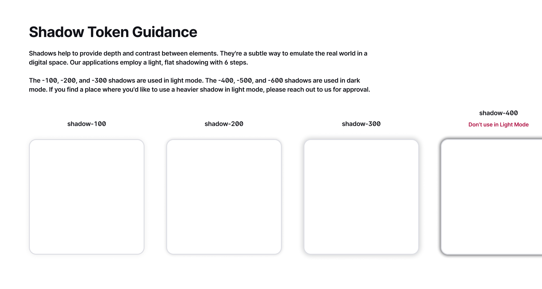
GDS includes tokens for UI colors, gradients, reporting colors, font family, font size, font weight, line height, letter spacing, spacing, layout, borders, radii, shadows, and elevation. Our color tokens also have a second semantic naming layer to guard against changes in the future. Those semantic names are neutral, primary, secondary, tertiary, accent, success, danger, warning, and highlight.
Color
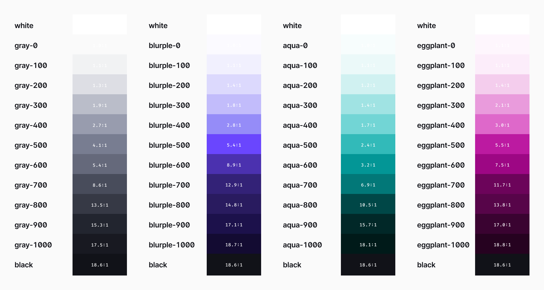
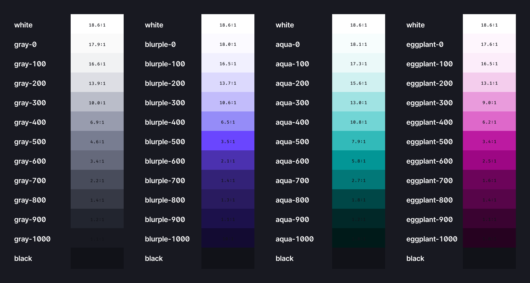
The 2021 rebrand brought a new vivid and rich set of color palette to Nielsen. Because of our emphasis on accessibility, I worked with the Marketing team to expand Nielsen's brand colors to the 11 scale interface colors available in GDS. These colors better fit the needs of UX designers and product development.
All the components are built to work in both light and dark mode. I saw this as an important accessibility issue to be addressed. To do this, I optimized the colors at the lighter and darker ends of the scale. The shades at the top and bottom give us excellent contrast and differentiation for our UI elements. When we create the dark mode of a component, we invert the color scale and tweak as needed.
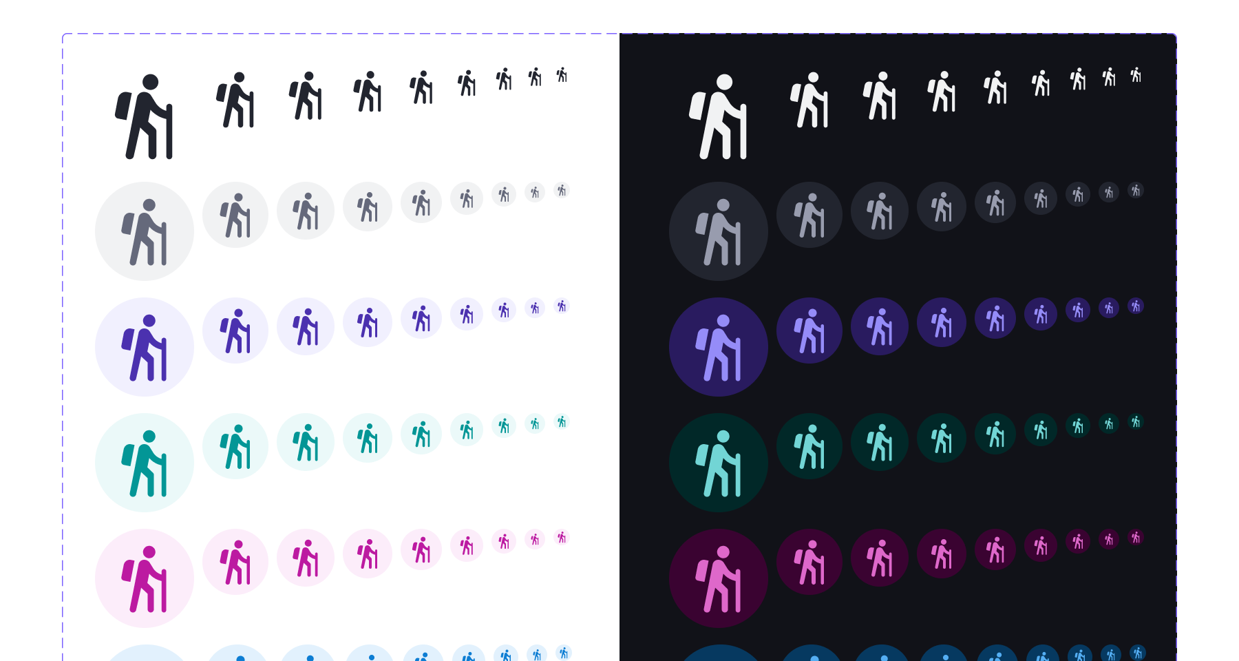
GDS has nine colors: gray, blurple, aqua, eggplant, blue, green, red, orange, and yellow and 11 steps for each color. Including the colors white and black gives us a total of 101 interface colors. These colors are used throughout every part of Nielsen applications. The lone exception is reporting colors. I created a separate set of reporting colors to be used in data visualizations.
For more information, visit the Color page on GDS.
Typography
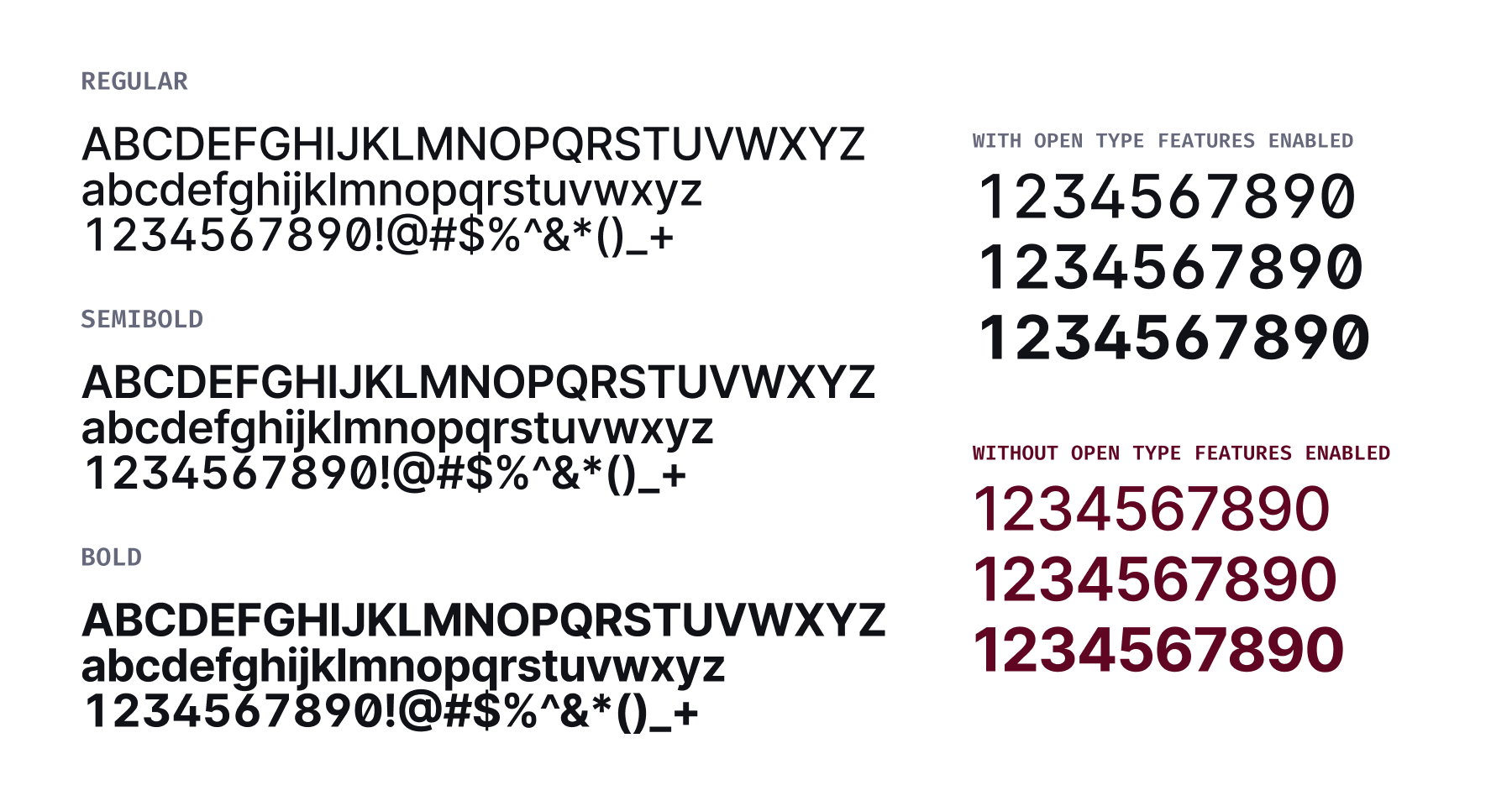
During the 2021 Nielsen rebrand, I helped convince the organization to choose Inter as the typeface for Nielsen's identity and products. Inter has excellent support for many Cyrillic, Greek, and Latin languages and will be used in all languages it supports. If Inter doesn't support a language, the fall back is Google's Noto Sans. Noto Sans has the most comprehensive language support of any typeface ever created. This makes it an excellent fallback for Nielsen products across the world.
Type Features
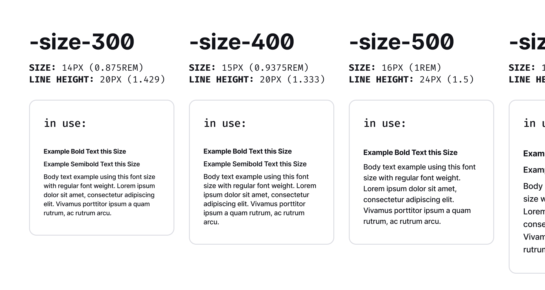
I created an 11-step type scale to give our designers ample options for building interfaces. Our base size is -size-500, which is 16px. These variety of sizes is not tied to specific headings. This something I see commonly and I find too inflexible. I prefer the typography scale be divorced from semantic headings so that pages can be more creative with how they use typography.
GDS has three font weights, Regular, Semibold, and Bold to help provide appropriate contrast between text. In the future I'd like to explore using the Variable Font version of Inter. It opens up a variety of possibilities for providing subtle font weight differences.
Inter has excellent support for OpenType, an advanced set of typographic features. We utilize slashed zero, open digits, and monospaced numbers in our applications. Doing this maximizes legibility and reduces the need for multiple typefaces in our applications.
For more information, visit the Typography page on GDS.
Accessibility
Nielsen's job is to count and include everyone. For this reason, all of the GDS foundations, components, and patterns meet WCAG 2.2 AA standards for accessibility on the web. By adhering to this standard, it raises the bar for Nielsen products and includes as many users as possible.
I focused our accessibility efforts on these key five areas:
- Including proper UI states for all components
- Ensuring proper color contrast for all text and elements
- Creating titles, headings, and navigation with proper semantic structure
- Using proper input assistance for instruction, errors, and submissions
- Supporting assistive technologies like screen readers and voice over
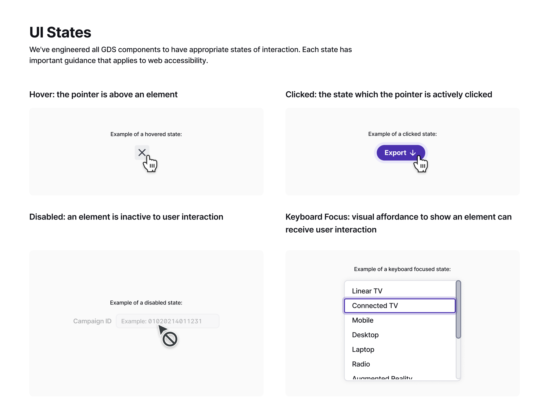
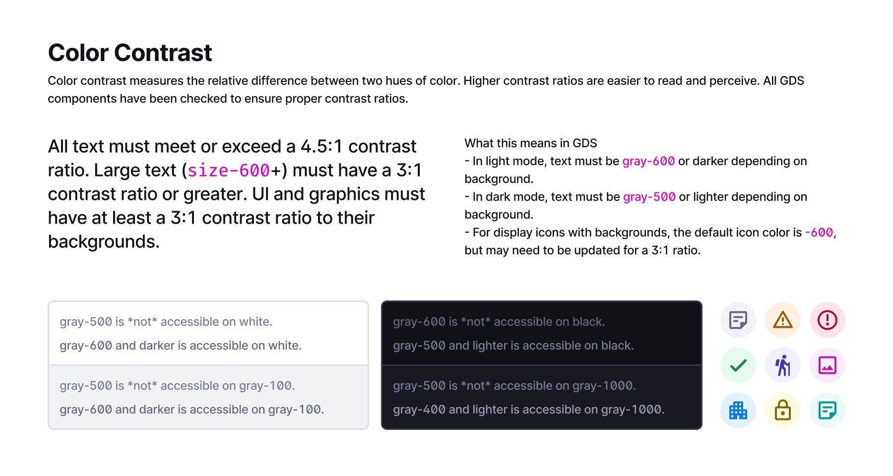
I took these accessibility considerations very seriously in my work on GDS. Every text and UI element was checked to be sure they had proper contrast ratios (3:1 for UI elements, 4.5:1 for text). I helped write documentation to encourage proper page structure for headings and other semantic elements. And I updated our components to provide proper input guidance for minimum target sizing, dragging movements, and error prevention for modifying data.
Many of the ways web applications are made accessible are implemented by engineering. These include ARIA labels, tab ordering, alt text, landmarks, and skip links. When collaborating with development, designers should contribute and include guidance whenever possible. A design system is the most effective place for these kinds of accessibility is a standards to live. They should be baked into the system's foundations, components, and patterns. And live as a set of documents that designers and developers can frequently refer to if they need a refresher.
Creating accessible applications must include conversations between designers, developers, and importantly, folks with disabilities. Accessibility isn't an add-on or a box to be checked. It's empathetically and thoughtfully providing resources to all kinds of folks. People with disabilities should be able to use any application simply because it's the right thing to do. Accessibility hurts no one and helps everyone.
For more information, visit the Accessibility page on GDS.
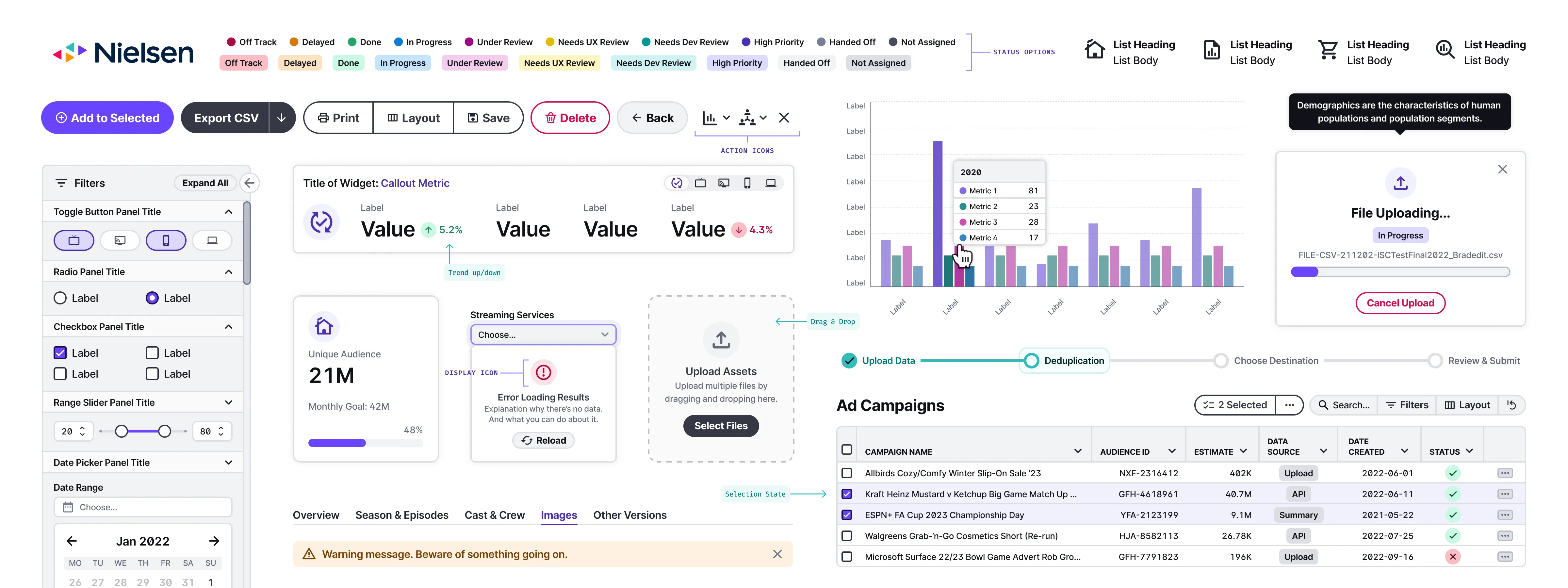
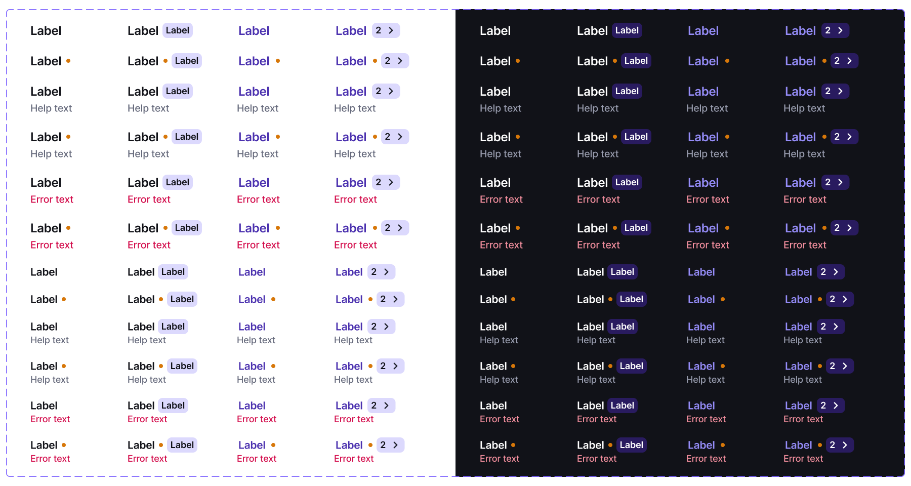
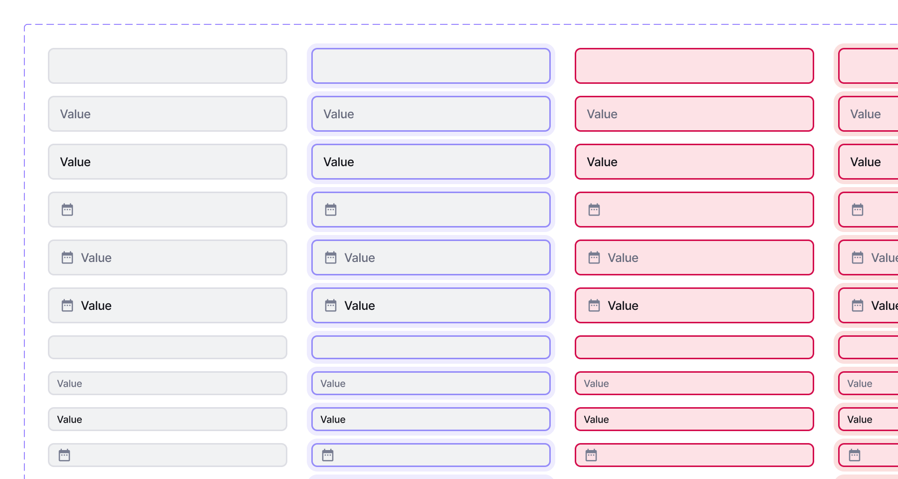
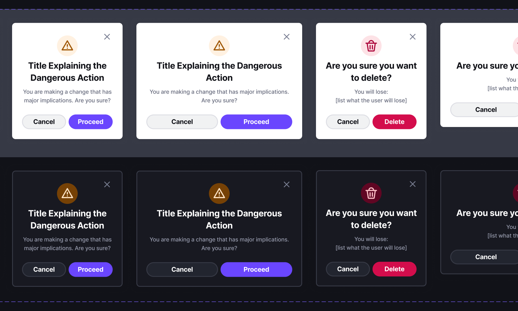
Building Components
Components are the core reusable parts of a design system. After the foundations are firm, building a great design system starts with creating components with the right options for UX designers. This ensures they have tools to solve a variety of problems. The goal isn't to build a single, immovable solution. Rather, to build a thoughtful and flexible system for solving problems we haven't even considered.
It all starts by creating the smallest, most reusable parts. Sometimes these are call atoms or primitives. Then slowly layering in complexity into components, patterns, and templates to help solve user problems. The components are the key to everything.
Designing in Figma
When building components I do my best to capture all the potential variants the component will need. This requires an understanding of the myriad ways the component could conceivably be used. Though, there are always inconceivable ways they can be used too. 😉 Once all the variants are mapped out, I build the Figma component. Figma's support for component properties is an invaluable tool for building robust components. When building, I include all the variants like color mode (light/dark), state (default, hover, selected, focused, etc.), content, and whatever options that are particular to only that component.
I start by building the core components possible. And when needed, layer them together to create larger components. Getting the core right is so important. The choices made for the core components cascade throughout the system. Thoughtfully anticipating issues and addressing them early enables the system to scale smoothly.
For more information, visit the Components page on GDS.
Writing Documentation
I have found writing documentation and training materials for a design system to be incredibly arduous work. It requires intense focus on the system's details and deep insight into the products the system serves. It has to be both precise and concise. It should be written in for both technical and non-technical readers. And it should be a living document that is updated whenever new updates or solutions are found.
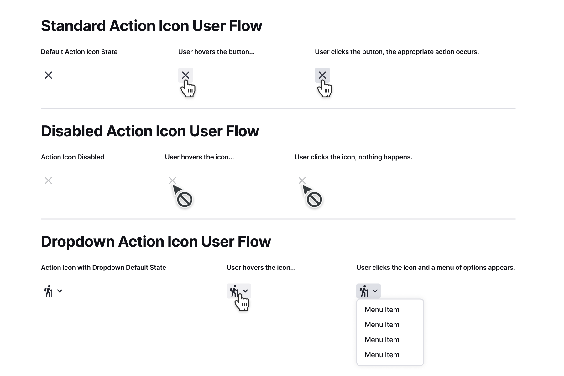
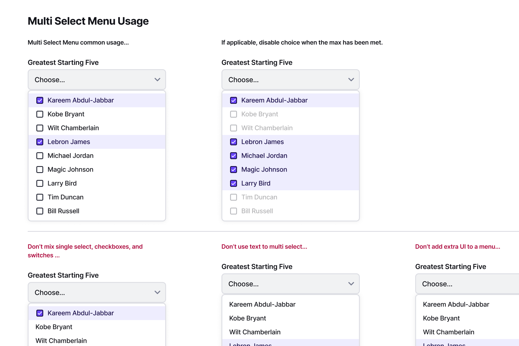
In GDS there were two main kinds of documentation I created, user flows and component design principles. User flows were housed in Figma and the component documentation lived on the design system website. The User Flows in GDS describe in detail each interaction the component could have. This became an important deliverable for developers. It helped begin the conversation with development for how the component should work in code.
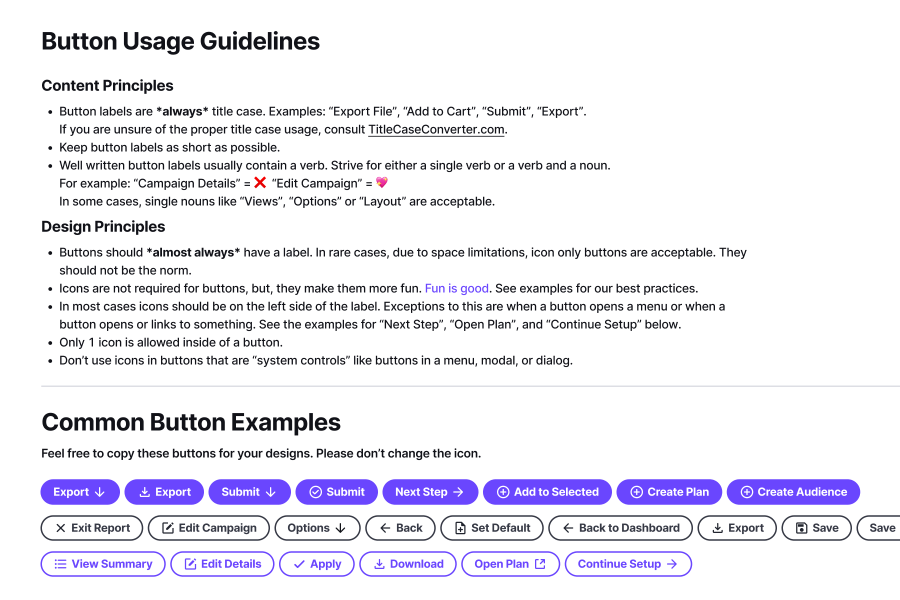
I wrote the website so that it was authoritative, but not preachy. For each component, I focused on three key areas: the component's description, design principles, and do's and don'ts. Design principles house most of the written guidance for using the component. Writing this can be tricky because it needs to be precise, but not too specific.
I think design system documentation can be a great way to teach younger designers the foundations of design. Because of this, I wrote with as few assumptions as possible. I tried to explain the concepts of design (eg: typography, grid system, component properties, etc.) succinctly, but thoroughly so folks with less design experience would understand.