Colorado State Tax Portal
Colorado's existing tax system served hundreds of thousands of businesses but was difficult to navigate, visually inconsistent, and scored shockingly low on accessibility compliance. My design system served as a new visual foundation for building a modern, accessible user interface. I contributed to the research, created components, and designed the core user flows and interfaces for the tax filing and payment processes.
Colorado State Tax Portal Login ↗
The Big Problem
A long time client to GovOS, The State of Colorado, had grown extremely frustrated with its aging Sales and Use Tax payment portal. It served hundreds of thousands of businesses who have locations or employees in Colorado and it was time for major improvements. The legacy experience was difficult to navigate, visually inconsistent, and frustrating for users trying to complete common but essential tasks like filing taxes and managing business licenses.
The issue was a big enough deal that in 2023 Colorado passed House Bill 23-1017, the Electronic Sales & Use Tax Simplification System bill to allocate $5.4 million to fix the portal's issues. This bill was both an opportunity and a challenge. It made sure resources were available to create a new application, but it was also clear that if the job wasn't done well, the state would be pursuing other vendors. The application was built and delivered before my tenure, but when I reflected on the bill, it was humbling for a government to allocate millions of dollars to ensure you improve your application to do what it should already do well.
Maybe the worst part was, the current application scored extremely low on accessibility checkers in violation of both federal and state laws. That opened up the state to potential litigation from the public. Given all of this, it became clear to the state that it needed a modern and accessible web application that would dramatically improve usability.
Design & Systems Approach
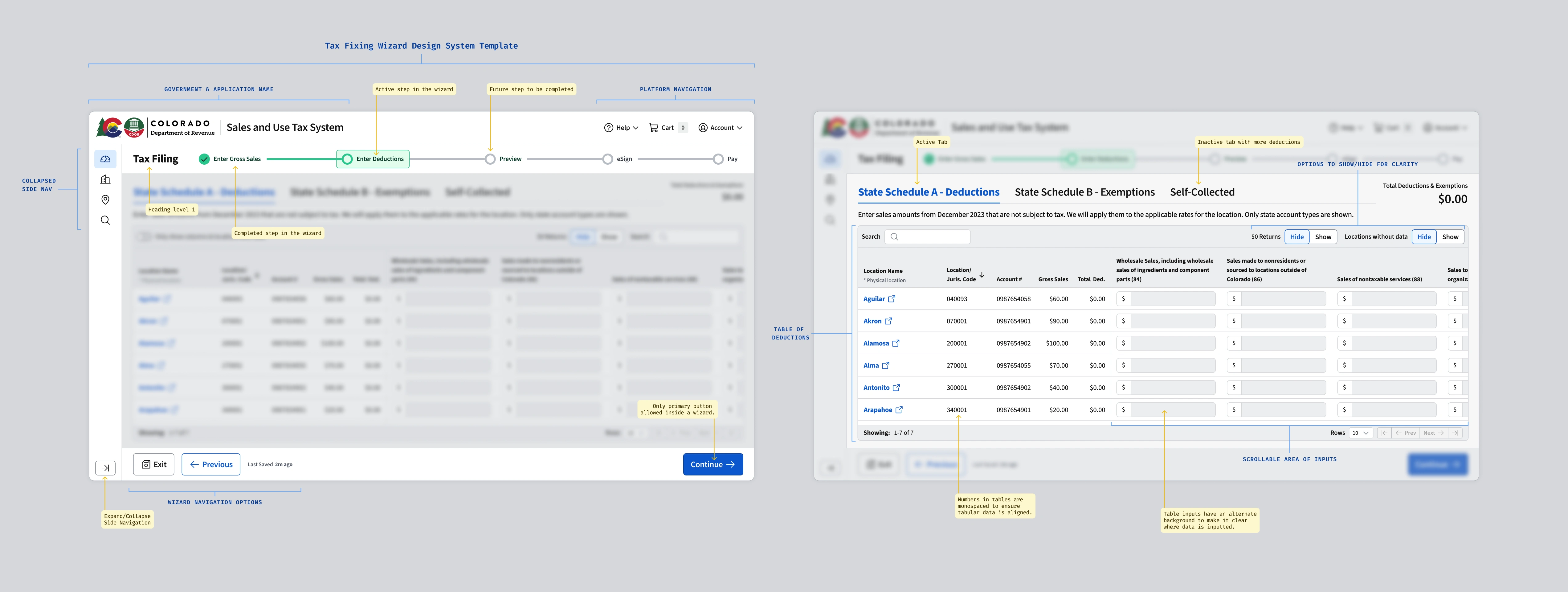
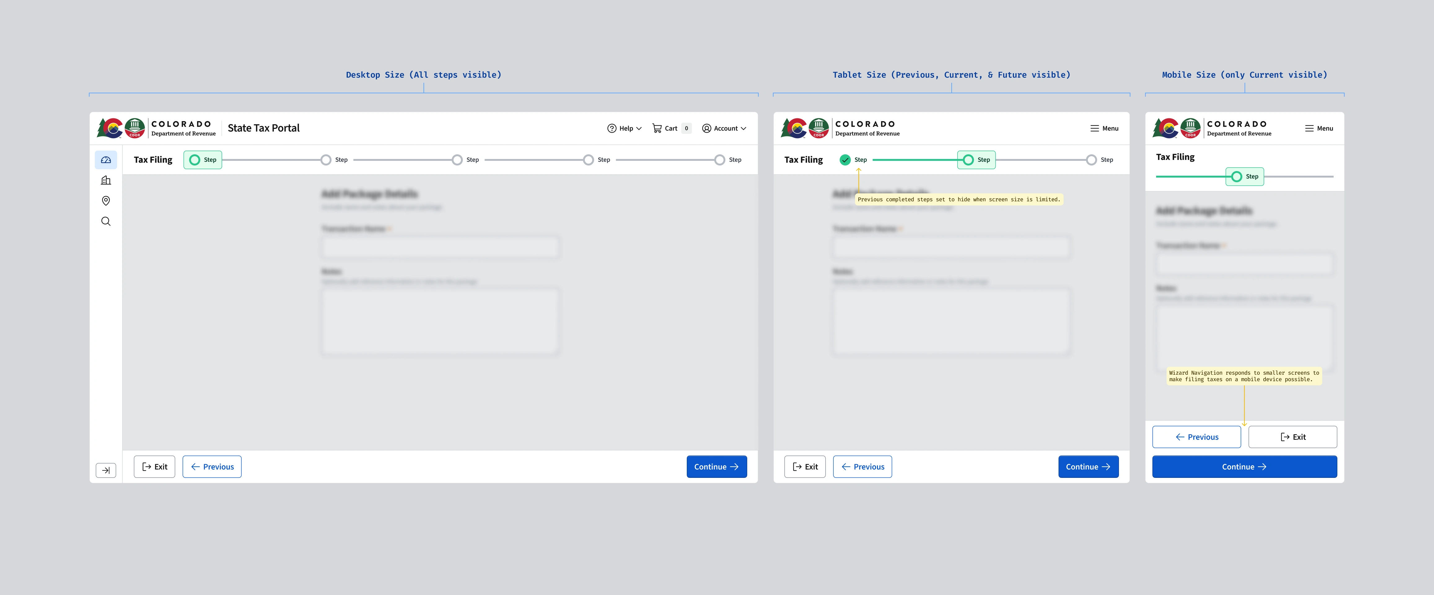
When this opportunity came up the design system was still in its infancy. We had core foundations like our color scale, typography scale, iconography, and a handful of core components (button, menu, basic table, etc.) developed in code, but the system was far from mature. I had been hired in part to build the design system and get as far as I could before designs and code needed to be delivered. I pushed as hard as I could and I was very glad that I did. Those components and foundations would be the core that the application was developed on. Anything not fully ready would be custom built using Radix primitives and refactored later. This was not ideal, but it was far better than having no design system at all and choosing something off the shelf.
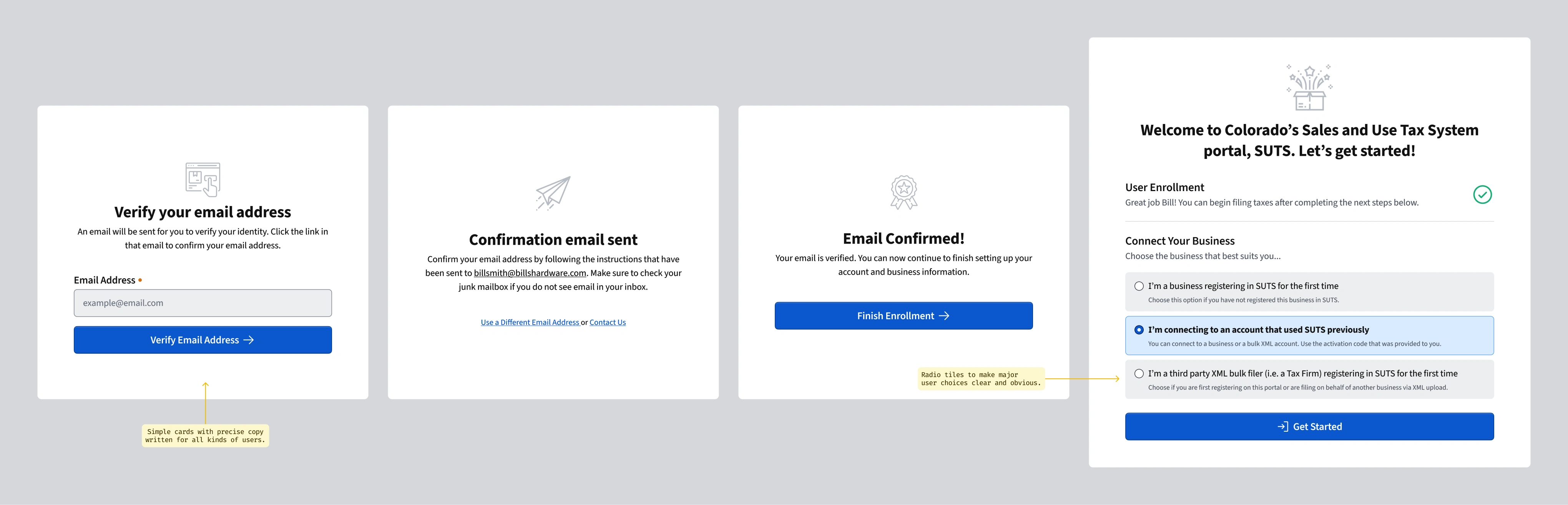
Before starting to design the new application, we began by understanding the core users and their needs and outcomes. It had been decades since this had been examined, so there were many things to learn, integrate, and update. We began by interviewing users onsite. This provided many important insights that made their way into designing flows and building the interface to fit what they needed.
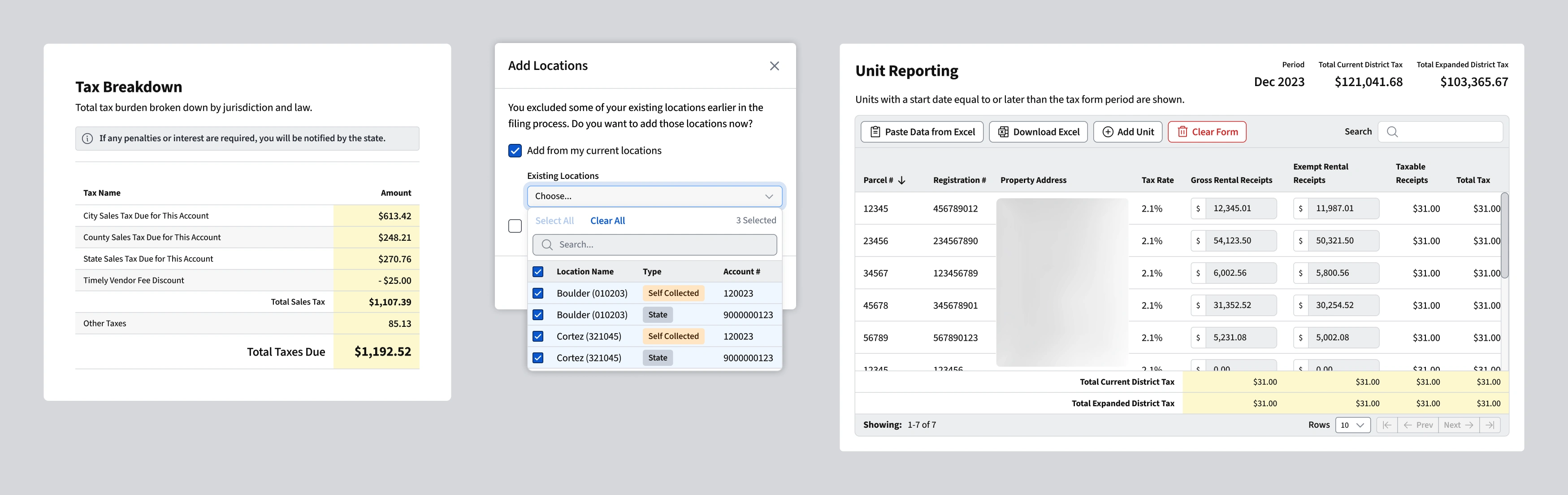
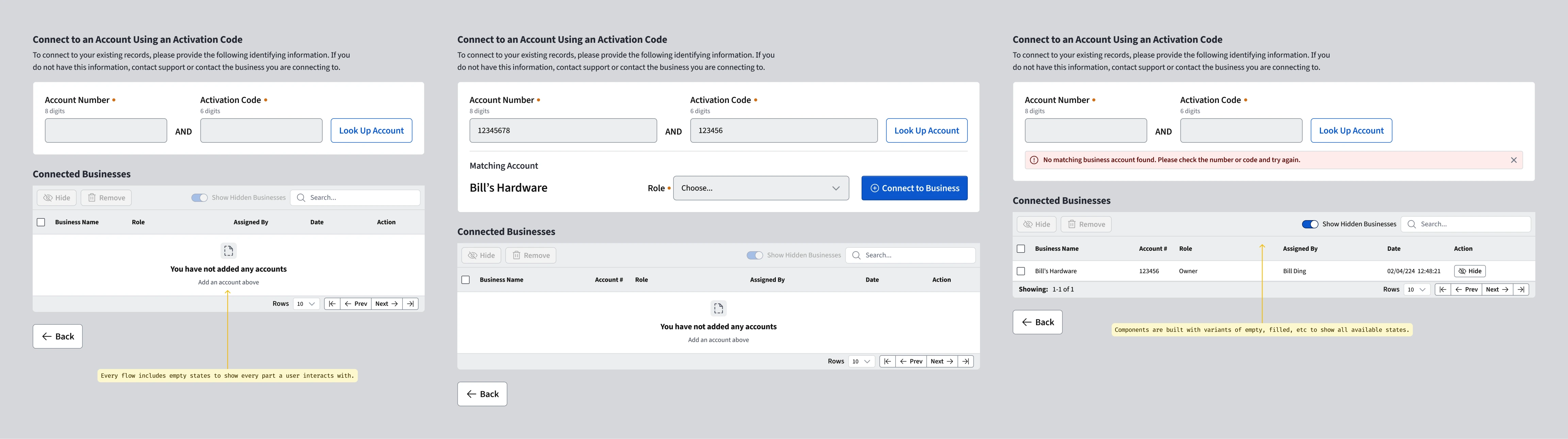
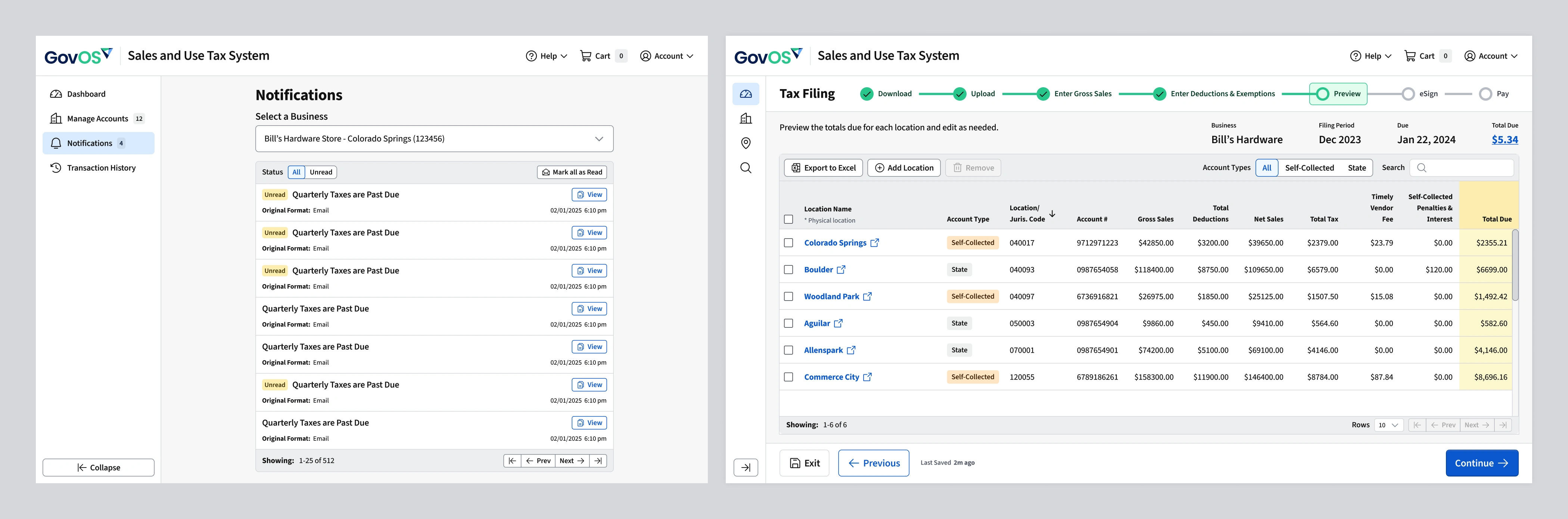
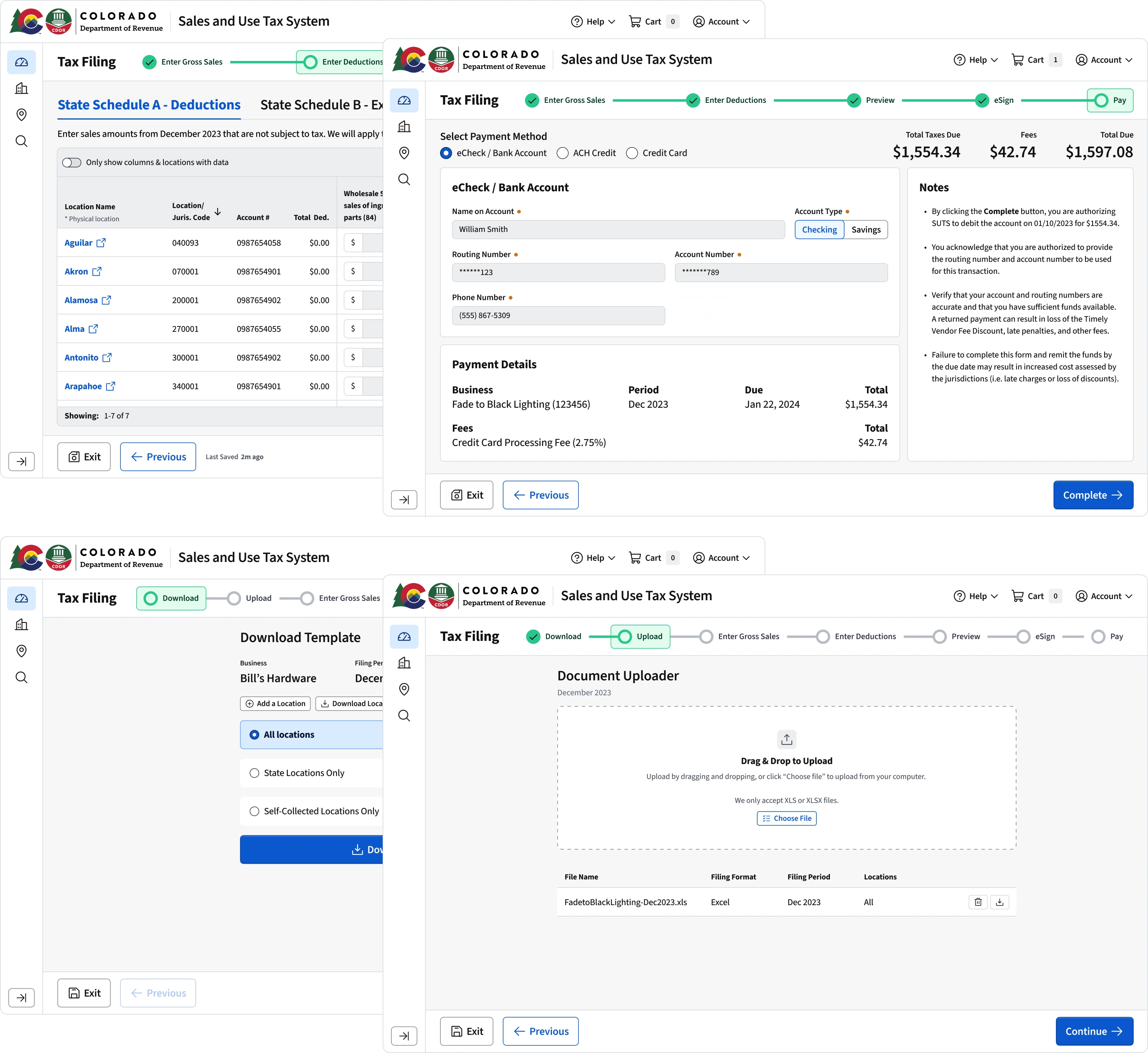
Mapping the core filing workflows was the most important part of the whole application. Users had two major ways of filing: stepping through a workflow in the application or by uploading a spreadsheet. Nearly all tax professionals uploaded spreadsheets, and nearly all of the business users stepped through the workflow. It was a clear delineation between common user and power user that helped determine how to appropriately bifurcate the flows and interfaces.
Product Collaboration
During this process we worked closely with the State of Colorado's stakeholders and subject matter experts to translate regulatory requirements into user flows. We didn't design screens in isolation. We built workflows and a wizard with clear progress indicators, form patterns, predictable validation, and confirmations that reduced uncertainty. Prototypes were shared frequently with the state to align on interpretation of tax rules and to catch gaps before development began.
As flows stabilized, I worked to ensure that recurring interaction patterns were absorbed back into the design system. Complex form components, validation states, error messaging, alerts, and layout structures were standardized so teams weren't solving the same problems repeatedly. This helped the system and the product mature together. The system allowed us to move quickly without sacrificing long-term coherence, and it was used in a way that fit the tax portal uniquely. We embedded accessibility, hierarchy, and validation logic directly into components and reduced the overall cognitive load for users.