Redesign: bradsiefert.com
2025-09-01
Over the past few months, I’ve been working on a fresh design for bradsiefert.com. I've spruced up the UI, design system, and did some spring cleaning on the frontend. I upgraded to a recent version of Nuxt, which has become my go‑to framework for personal projects. I was able to go all the way to Nuxt 4 because of some issues with @nuxt/content but I'm hoping to get those issues ironed out down the line.
A big part of this update was experimenting with new tools. I used Figma MCP directly into Cursor to build out a layout and do a first pass at styling. It dramatically sped up initial the development workflow, especially the cleanup and content refactoring.
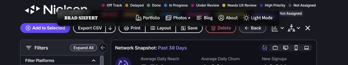
My favorite part of the site is building out a web version of a Liquid Glass like navbar. Unfortunately, Figma MCP was no help with this, it required combing around Codepen and inspecting how others were implimenting their versions. Creating it on the web is difficult, but some ingenuitive designers and developers have found ways to get close. My version is a balance between refraction and glossy to keep any accessiblity and readability issues at a minimum.

It’s a big update to add a new case study for my work at GovOS, added better light and dark mode switching, styled the blog cleaner, and rewrote all the content on the core pages. The site is cleaner, faster, and more true to my current design ethos. It's what I want my own corner of the internet to be.